Sell products through eCommerce sites like Shopify or Woo Commerce? Track inventory fulfillment through DEAR Systems, Locate Inventory, or KatanaMRP? You can automatically create a dashboard in just a few clicks in Easy Insight to look at your entire business through marketing, CRM, eCommerce, inventory fulfillment, and accounting.
First, connect Easy Insight to your various data sources from the Connections page. For example, you might connect Google Analytics and Facebook Ads for marketing, Hubspot or Salesforce for CRM, Shopify or Woo Commerce for eCommerce, DEAR Systems, Locate Inventory, or KatanaMRP for inventory, and Xero or QuickBooks Online for accounting.
Once you have your data sources connected, all you have to do is click on 'Consolidate Data and Generate Dashboard' from the Home page or any of the data source pages. Please note that this option will only appear at this point for inventory-specific data--you'll need to at least have a connection to one of the storefront or inventory systems first.
Clicking on 'Consolidate Data and Generate Dashboard' pops up an explanation window of what's going to happen. If you have multiple Shopify or DEAR connections, they'll be automatically federated together, and all valid data sources in your account will be combined into a single auto generated combined data source.
After you click 'Auto Create Dashboard', Easy Insight will start combining the data and generating the dashboard for you. This process may take a couple of minutes.
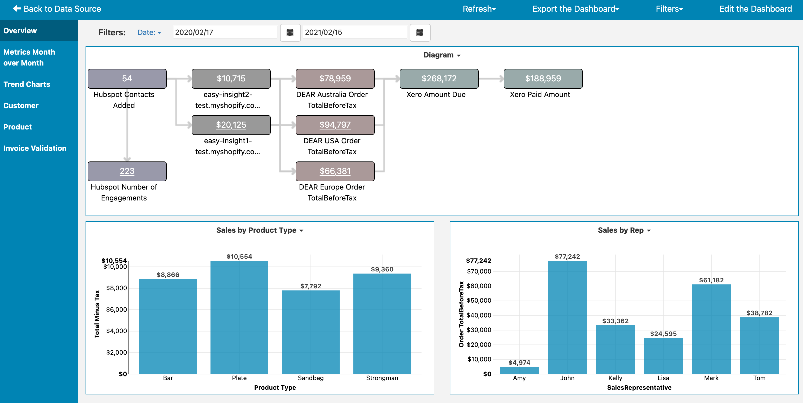
The first page of the dashboard includes a diagram of your business, showing the customer flow from lead generation into eCommerce into fulfillment and finally into accounting. You can click on any of the underlined metrics to pull up the prebuilt dashboard for the matching data source. For example, clicking on Shopify Order Total in the screenshot below pulls up the Shopify prebuilt dashboard:
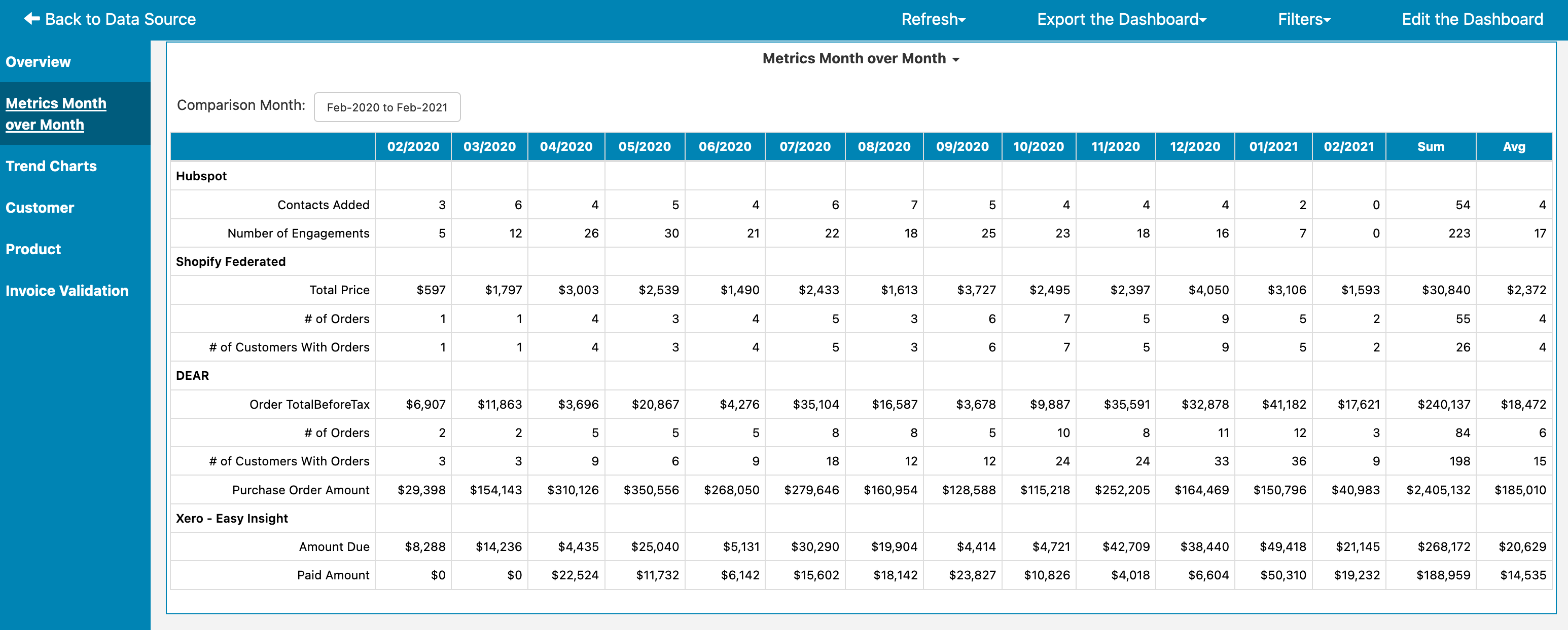
The Metrics Month over Month table gives you a month over month view of metrics across all of your data sources:
The Trends tab includes trend charts from all of your data sources, helping you to visually understand changes in your business:
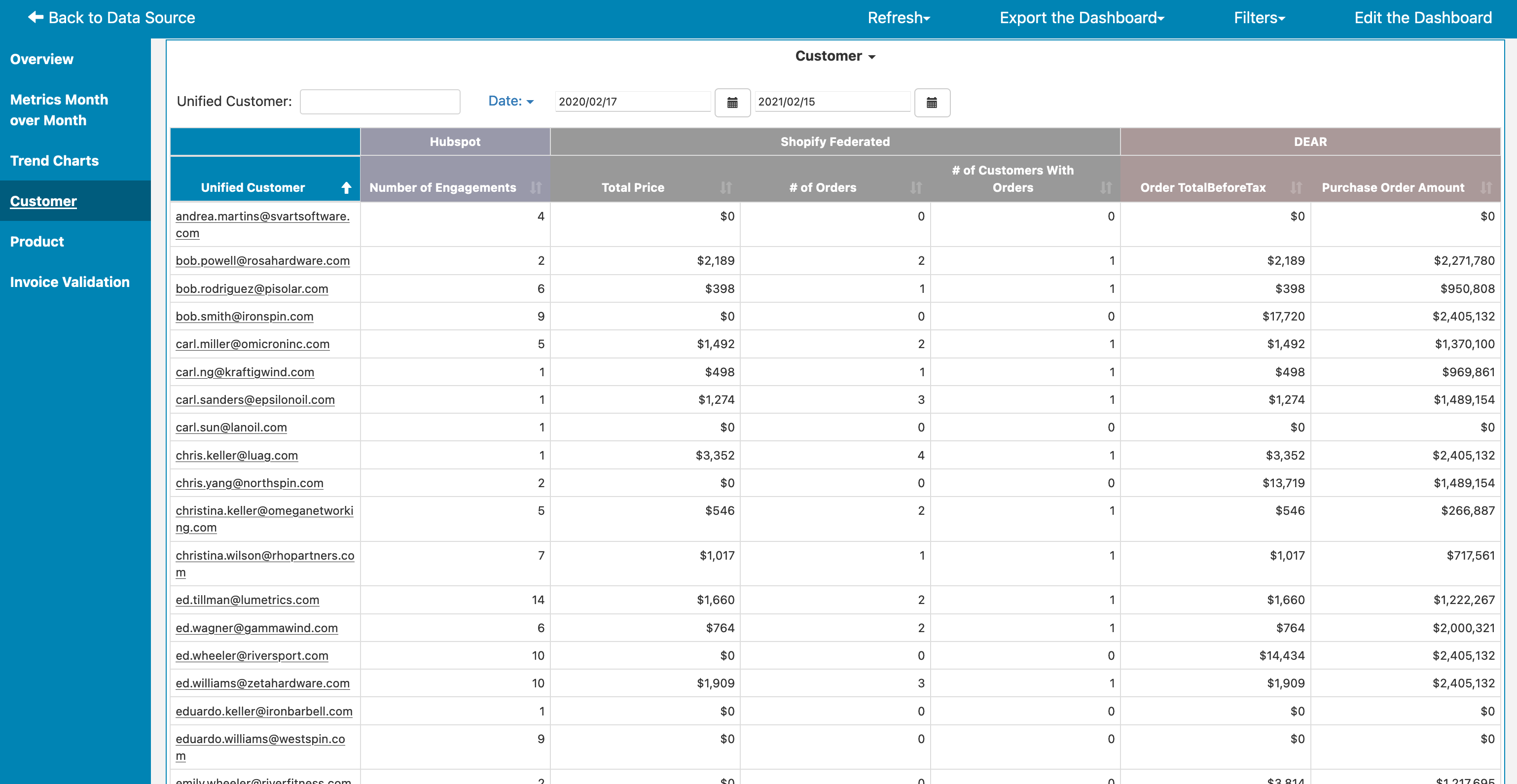
The Customer tab provides a view of your customers from across all of your systems. For each customer, you can see the various key metrics matching to each customer. You can click on the underlined customer email to pull up a single consolidated view of the customer across all systems. In the example below, we can see the sales activites, Shopify orders, and DEAR orders all matching to one customer. We can also click on the 'View in Hubspot', 'View in Shopify', or 'View in DEAR Systems' links to jump to the specific customer record in that system.
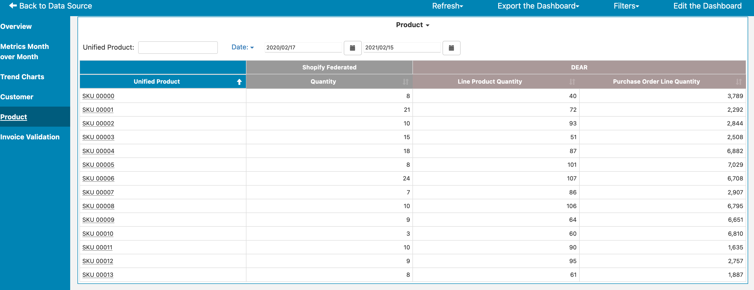
The Product tab does the same thing as the Customer tab, but with product SKUs and related metrics. Again, you can click into a particular SKU to see everything tied to that SKU across all of your systems:
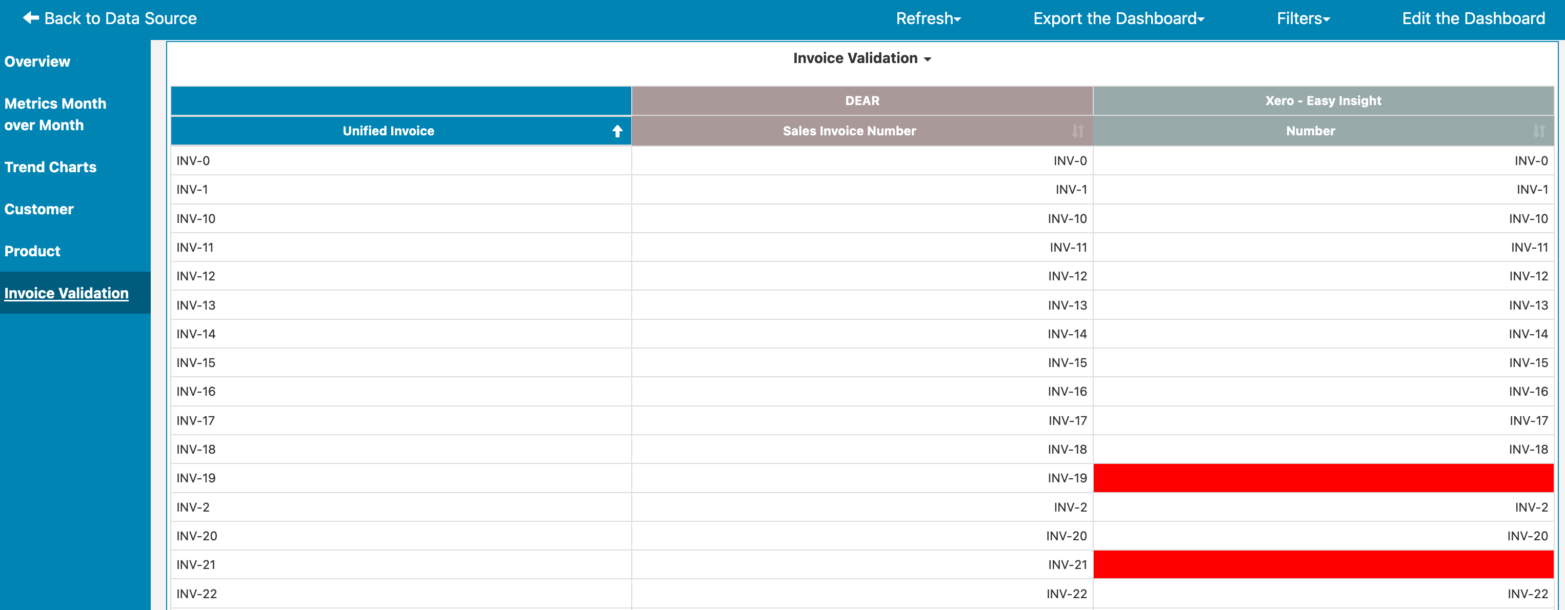
Finally, the Invoice Validation tab gives you a comparison of invoices to your accounting system, helping you to identify where data is mismatched between different systems:
From here, you can customize any of these reports in the usual way you'd change anything in Easy Insight, but you can use this dashboard and its reports as a starting point to fully visualize your business. For next steps, we recommend checking out Report Basics and Dashboard Basics for customizing your reports and dashboard.